Icons
Icon guidance for Aqqo products using the Phosphor icon library.
Our product interfaces use Phosphor Icons. We focus on two visual variants to keep usage consistent across all flows: bold and duotone.
Approach
- Use clear, familiar symbols that are easy to scan.
- Keep icon meaning functional first; avoid decorative use in dense product screens.
- Pair icons with labels when meaning could be ambiguous.
Variants
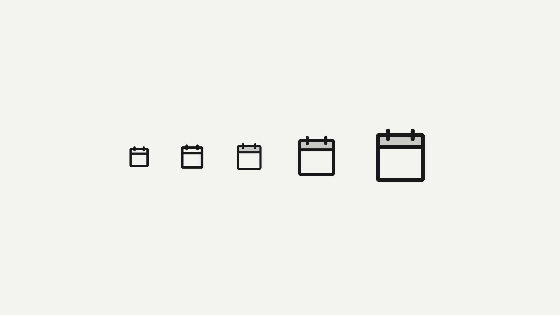
Choose the icon variant by size:
12pxand14px: use bold16px,24px, and32px: use duotone
This keeps small icons visually strong and larger icons expressive without becoming heavy.
Sizing
Product
In product we use icon sizes 12px, 14px, 16px, 24px and 32px.
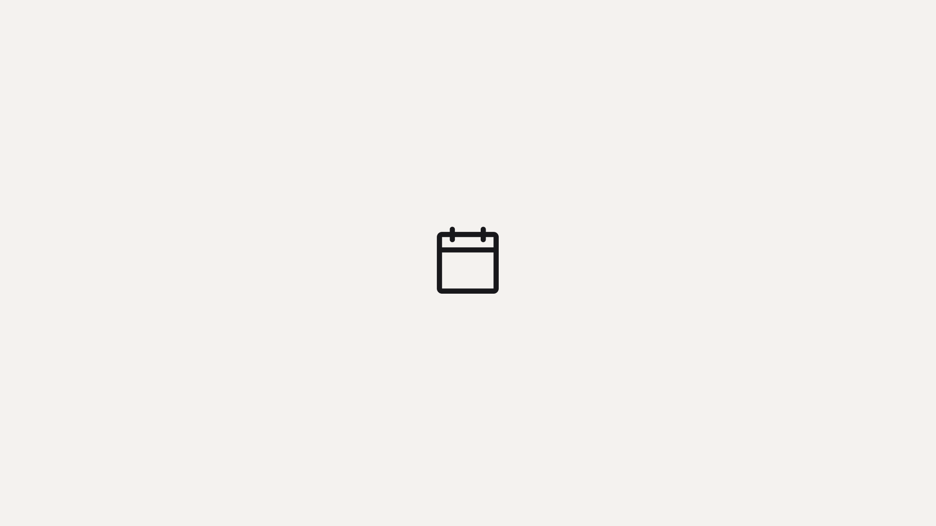
Website
For website we use icons at 24px and always the regular variant.
Usage Reference
| Context | Size | Variant |
|---|---|---|
| Product | 12px | Bold |
| Product | 14px | Bold |
| Product | 16px | Duotone |
| Product | 24px | Duotone |
| Product | 32px | Duotone |
| Website | 24px | Regular |
Implementation Example
import { HouseIcon, CalendarIcon } from "@phosphor-icons/react";

// 14px icon: bold
<HouseIcon size={14} weight="bold" />

// 24px icon: duotone
<CalendarIcon size={24} weight="duotone" />